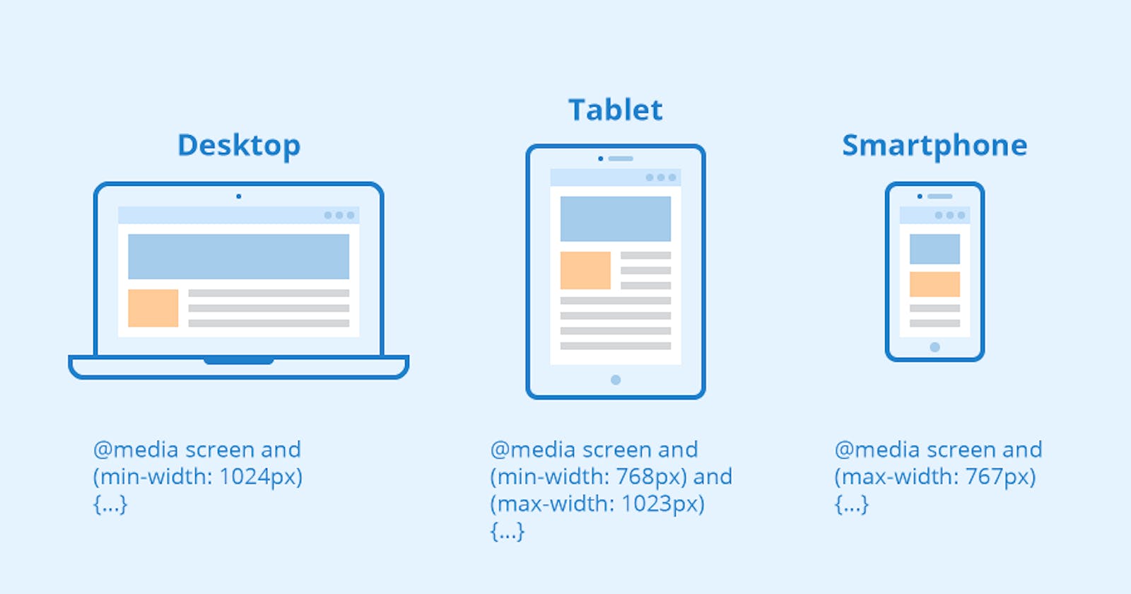
Media queries are a key component of responsive web design, allowing websites to adapt their layout and presentation based on the characteristics of the device or screen on which they are being viewed. By using media queries, developers can create websites that provide an optimal user experience across a wide range of devices, from desktop computers to smartphones and tablets.
A media query consists of a media type and one or more expressions that check for certain conditions to be met. The media type defines the category of the device or medium being targeted, such as screen, print, or speech. The expressions, also known as media features, check for specific characteristics of the device, such as its width, height, orientation, or resolution.
Media queries are written in CSS (Cascading Style Sheets) and are typically included within the style sheet of a web page. They are introduced with the @media rule, followed by the media type and expressions enclosed in parentheses. Here's an example of a media query that targets devices with a maximum width of 768 pixels:
@media screen and (max-width: 768px) {
  /* CSS rules for screens with a maximum width of 768px */
}
In the example above, the media type is "screen," indicating that the styles within the media query should apply only to screens. The expression (max-width: 768px) checks if the maximum width of the device is 768 pixels or less. If the condition is true, the CSS rules within the curly braces will be applied.
Media queries allow developers to create responsive designs by specifying different styles for different screen sizes or device characteristics. This enables them to optimize the layout, typography, and overall presentation of a website based on the available screen space. For example, a responsive website might display a two-column layout on larger screens, but switch to a single-column layout on smaller screens to ensure better readability and usability.
Media queries can also be used to target specific devices or device features. For instance, you can apply different styles to devices with high-resolution displays (min-resolution), devices in landscape or portrait orientation (orientation), or devices that support touch input (hover).
By using media queries effectively, web developers can create flexible and adaptive designs that provide a seamless user experience across various devices and screen sizes. This helps to ensure that websites look and function well, regardless of whether they are viewed on a large desktop monitor, a tablet, or a smartphone.
